Key Factors and Variances Driving Low ISO Scores
Following up our ISO score analysis, we unravel the mysteries of low ISO scores in various states, exploring factors such as department-to-district ratios and the critical role of water access.
Unlocking ISO Myteries
Our last blog post about ISO scores generated more interest than previous posts, so we’re doing part 2.
Last time we posted about states with scores of 8B or higher.
What about states with a high concentration of scores that are 3 or lower?
Several states stood well above the rest.

We’re not sure what these states have in common, or what’s driving the higher-than-average concentration of low ISO scores.
What’s driving the higher-than-average concentration of low ISO scores? One possible explanation is the number ratings given relative to the number of departments within the state.
Having more departments per district rated likely means that the district has more fire stations, firefighters, and equipment than others. Number of personnel is a simple but important driver of ISO scores.
This appears to be the based on the below:
Highest # of Departments to Districts Ratio
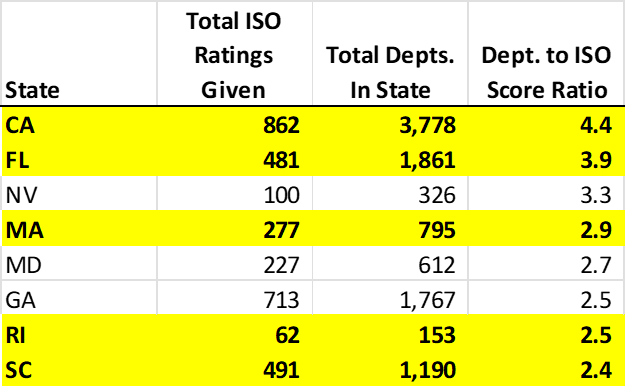
Source: ISO and FEMA Database
Again, access to water, geographic density, and other factors are key drivers of ISO scores. A score of 7 may be well above average in North Dakota, but well below average in California.
Access to Water
In a previous blog post, we discussed how water access can limit a department’s ability to improve its ISO score.
Communities with hundreds of firefighters, dozens of apparatuses, and a perfect process may no tbe able to improve beyond a score of 8B.
A total of 30 points are allocated to water supply (29% of overall score).
For most of our clients, access to water means access to money.
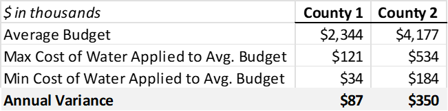
We investigated the cost of water supply for two different sets of customers. This was done using publicly available budgets. We compared two counties in the same state. These two counties are right next to each other. They share a border.
To compare apples to apples, we used water costs as a percent of total budget. We removed one-time equipment and capital costs from the budget.
We found significant variance between the two counties. Interestingly, we also found that water costs can vary significantly within the same county.

A department with a $2.5 million dollar budget could hypothetically pay $90,000 more a year for water access than another department in the same county with the same size budget.
How does this compare to your county? What are we missing? What drives the variance?